Renewable Energy
Electrix
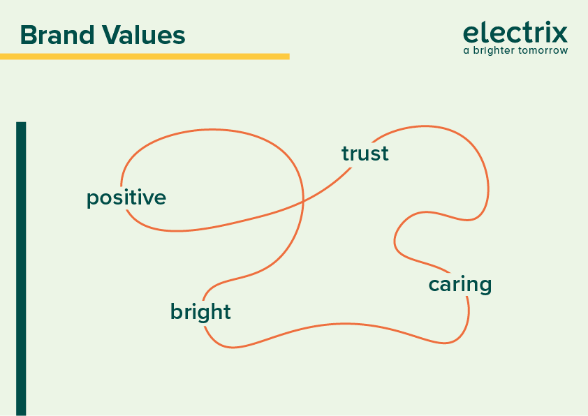
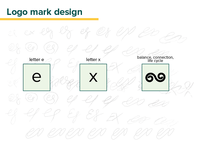
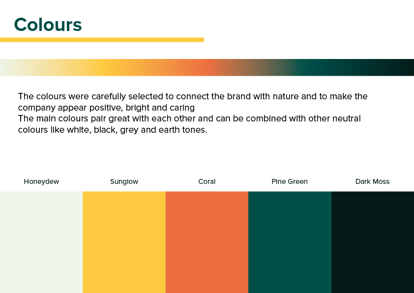
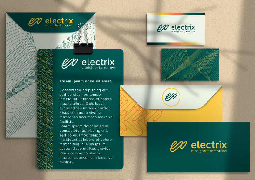
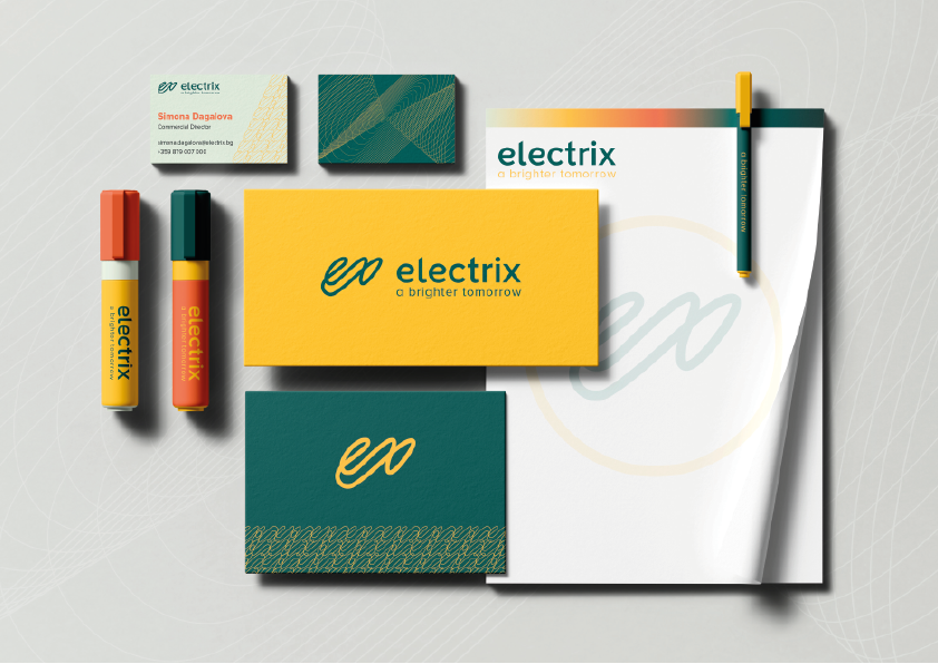
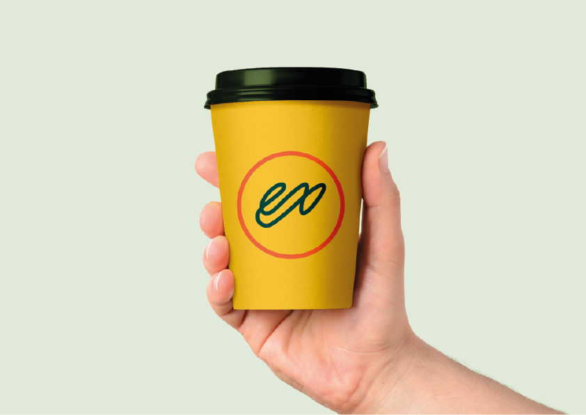
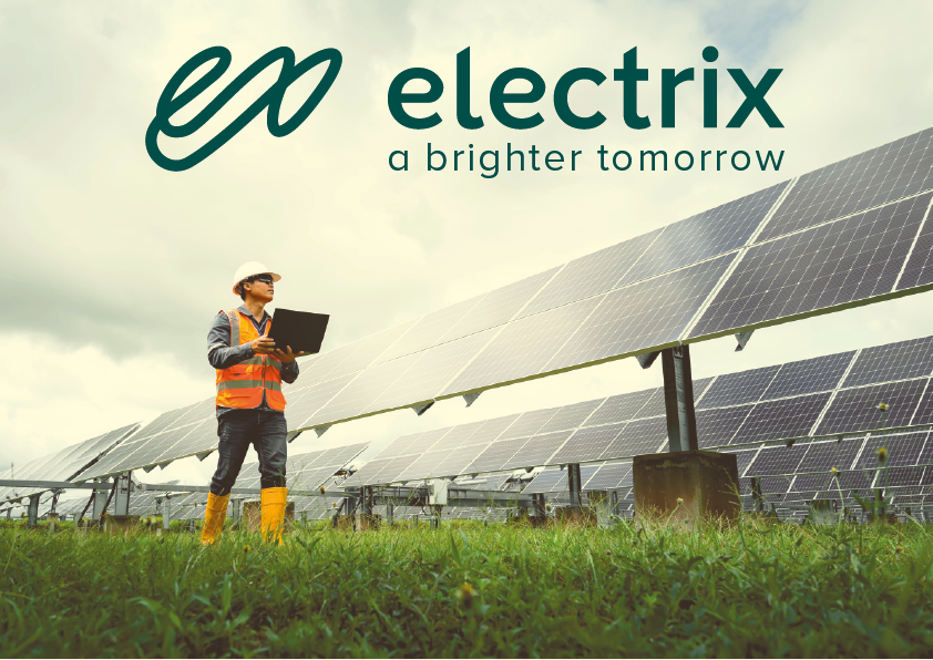
This logo and brand identity was one of a few proposals for a real client. The brand offers renewable energy solutions to investors, making them a B2B company. The logo mark was created with consideration of the brand’s values and future, sticking to a clean and modern look, making it adaptable and able to withstand time and trends.The mark consists of the letters “e” and “x” – the start and the finish of the name, and are connected without a break. This symbolises the brand’s field of work, the sun, and its connection to us and life itself. The logotype was personalised to fit with the logo mark and the brand’s feel. The overall aesthetic of the brand identity was finalised with the colour palette and supporting elements, making the company look modern, friendly and trustworthy.
